Do you like Genesis Blocks collection but you will like to have more control over the accordion block design? In this tutorial you will learn how you can customize it with few lines of CSS.
UPDATE: If you prefer to use the WordPress Site Editor native blocks to create an accordion, take a look at this tutorial where we show you how to customize the Details Block with a bit of CSS.
Nowadays, in addition to the native blocks of WordPress, the block library that we use mainly in our WordPress projects is Genesis Blocks (formerly Atomic Blocks).
We use it for those additional elements that we may need, such as containers, advanced columns or the accordions. The later is very useful for the common layout of FAQ or in those pages that have a lot of content and it is more tidy and convenient to group them in small sections.
However, the styles that come by default for the block accordion are quite limited and do not always fit well with the web design.

Although it allows you to customize typography, colors and sizes, you cannot change the style of the arrow that appears to expand the element or its location, and that restricts a lot and makes this block very similar on all pages.
To avoid this, you can use some CSS classes, some very intuitive and others not so much, to customize it.
The HTML structure of the block is quite simple:

- gb-block-accordion: the whole block
- details: includes title and content
- gb-accordion-title: the title part
- gb-accordion-text: the content that appears when it is displayed.
Adding or modifying styles for these elements is simple, but nowhere in the code or in the inspector does the arrow icon appear to the left of the title, and modifying it does not seem so easy.
GB accordion adds the arrow using a native element (-webkit-details-marker) of the browser we are using, and to access it we must use .gb-block-accordion .gb-accordion-title::-webkit-details-marker.
The easiest way is to hide it directly and then add, with :after or :before, according to whether we want our own icon to appear to the right or left of the title.
.gb-block-accordion .gb-accordion-title::-webkit-details-marker {
    display: none;
}
We added a custom arrow icon to the right:
.gb-block-accordion details .gb-accordion-title:after{
    content: url("images/chevron-down.svg");
    position: absolute;
    right: 2.4rem;
    top: 50%;
    line-height: 1;
}
To modify the icon when displaying the element, or any other style that you want to be shown differently if it is open or closed, you can use the open attribute that GB adds to details when the element is open:
Example: you can put the title in bold when it is displayed:
.gb-block-accordion details[open] .gb-accordion-title {
	font-weight: 600;
}
Or modify the icon:
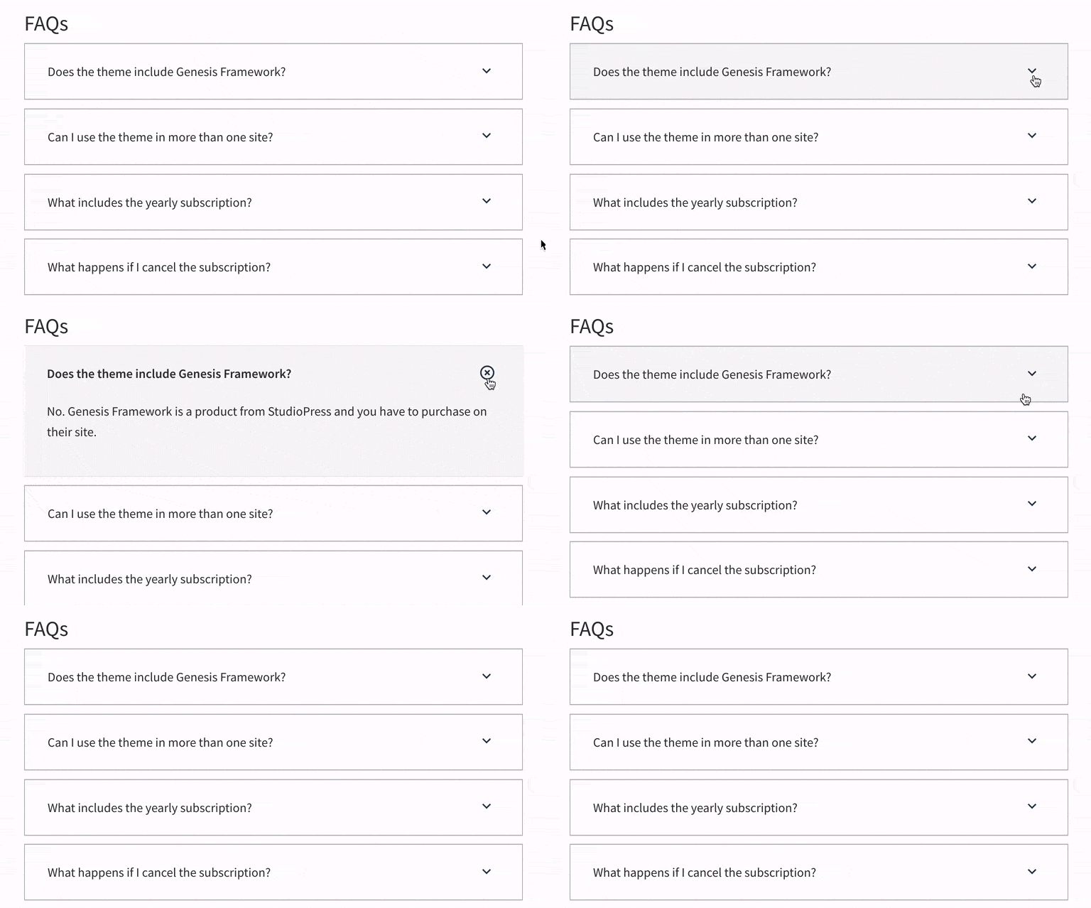
.gb-block-accordion details[open] .gb-accordion-title:after{
	content: url("images/close-circle-outline.svg");
}
You could also, instead of changing the image, make a CSS transformation if it is for example an arrow, simply rotate it down transform: translateY(-50%) rotate(-45deg); or change size, color, etc… any property that can be accessed from CSS.
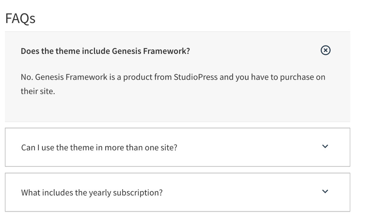
In this way with a few lines of CSS you can replace the standard accordion that we saw at the beginning, by this:

Or any variation you can think of.
As you see, knowing this you can get much more out of this Genesis Blocks block and avoid having to use different block libraries just for one element you don’t like.
REMEMBER: If you prefer to use the WordPress Site Editor native blocks to create an accordion, take a look at this tutorial where we show you how to customize the Details Block with a bit of CSS.
We hope you find the tutorial useful. If you have any question or suggestion just let us know in the comments

Leave a Reply